Showing posts with label revision for future assignments. Show all posts

21/01/2014

Representation of Women


MS1 - Media Representation

Q) With reference to your own detailed examples, explore representations of women in the media today (16).
A) A 'representation' can be broken down into 're-presentation' which means to show a constructed view of reality. Media can be described as a representation of factors such as age, gender, political or social issues (e.g.; homosexuality, substance abuse, etc), national and international events and national/regional identity. Whilst some representations confront both sides of a factor, other representations are one-sided. It is this type of representation that causes the most controversy and criticism from the global audience.
One factor of representation that receives criticism for being one-sided is the representation of women in the media. The creation of new communicative technology has caused a significant increase in media texts portraying women as sexual objects. This is sometimes called 'sexual objectification'. There are also media texts, particularly adverts, that campaign for the removal of this general perception of women and the awareness of the importance of gender equality.
Some media texts purposely sexualise women for the 'male gaze' (male gaze being a persuasive technique used by the media that specifically targets the male audience through exploiting a woman sexually). An example of an text that is a heavily sexualised representation of women is the marketing trailer for the game Leisure Suit Larry: Magna Cum Laude which was released in 2004. The trailer begins with a crowd of college students standing outside the campus, waiting for the arrival of the game's protagonist Larry Lovage. Amongst the crowd are women who we learn Larry is not attracted to. These women appear 'normal' and quite boring: they are flat-chested, their mannerisms are masculine and they are all wearing the same coordinated outfit of a plain t-shirt and a pair of trousers. This has been done to show that not every girl in this game is beautiful and not important to the game's plot. This makes the female audience feel quite insulted because the text has created this false perception that girls are only going to grab a person's attention if they are stunnning when, in fact, these 'plain' women could actually be the nicest.
The main storyline is about Larry Lovage, a sexually obsessed 'ladies man', who gets to choose which of the three most popular girls in his campus he would like to have sex with. This storyline represents women as second class and their only purpose is to please the man. This disgusts me - a member of a female audience - because this representation of women discards any aspirations of a sustainable future, such as a successful career or being able to settle down, that they have and, instead, replaces it with this idea that we want to sleep with men. This also makes me wonder if women, who actually dream of pursuing a life like those in this text, actually have respect for themselves.
The three main women, who are competing against each other to try and win Larry's 'love', are the archetypes of female sexualisation: their womanhood has been overexaggerated, their skimpy choice of outfits exploits their toned chests to everyone else, they are plastered in make-up and they are incredibly ditsy and coy towards Larry. This represents women as only being attractive to men if they have the 'perfect' figure. This makes curvacious girls feel even more self-conscious about their own figures and would feel pressured to lose weight in order to have a happy love life. This will also make mothers of the boys buying this game feel weary because they would be worried that the boys may admire the main protagonist to such an extent where they will actually copy his behaviour towards women and they may ignore or disassociate themselves from girls their age who are not size 6 or size 8 because 'Larry did not bother with them'.
At one point in the trailer, Larry suggests to a woman in underwear that they should have sex in a public area. Her response is a casual but upbeat, 'Oh ok'. This represents women as being people who lack the self-conscience to care about respecting themselves when it comes to fulfilling their love life. This not only insults women but it could also offend female victims of sexual abuse because they did not have a choice when they were attacked outside for the public to potentially witness the assault and to see that these women have a relaxed attitude towards prosmicuity may horrify them.
At the trailer's climax, Larry is surrounded with a woman at each shoulder. These women are wearing nothing but tiny underwear and dancing provocatively towards him. This represents all women as being suggestive or 'begging' for male attention. This annoys me because this representation of women is allowing boys, who could be playing this game, to assume that women only want to befriend men so that they could pursue a sexual relationship with them when, in fact, most women are not like that and view sex as a privilege or something that enhances a loving relationship rather than a hobby or a necessity.
 
This is a link for the Magna Cum Laude trailer: http://www.youtube.com/watch?v=kJO-qLbH1eo


Another example of a media text that is a sexualised representation of women is the trailer for the film Piranha 3D which was released in 2010. Despite it belonging in the horror film genre, one of the codes and conventions of horror films is to feature girls that are visually attractive so that they appeal to the targeted male audience.
When introducing the film's setting in the trailer, the cinematographer features young college students partying on a waterboat beach party. A medium close-up shot shows three young women, who look in their late teens to early twenties, dancing in nothing but their bikinis on one of the boats. One of the girls appears to be dancing in a suggestive manner as she combs her one hand through her hair and rubs her other hand over her breasts. This represents young women in particular as being people who exhibit themselves purposely to capture a man's attention. Whilst the male audience may like this type of dancing and will not be bothered by it, a female audience could possibly feel disgusted and ask why the woman would want to smoothe herself down in that manner whilst being surrounded by other people.
As the trailer progresses, a car of young women drives beside a man on a motorbike. At the start of this section, the women appear to be having fun in a harmless, flirtatious way. This is proved with the camera focusing on the man's bashful smile. However, one of the girls vigorously shakes her breasts in front of the motorcyclist, encouraging him to behave dangerously by driving faster and performing a wheelie in order to impress his admirers. This represents women as being irresponsible people and not willing to consider the consequences of their actions. Whilst some members of the audience may continue to believe that the girls are behaving in a harmless fashion, other members of the audience may question the reality behind this section and may even be put off from watching the film if they go on to believe that the rest of the trailer's events are influenced by the wreckless behaviour of the female characters.
One of the actresses that feature in this film is Kelly Brooks, an English model, who portrays one of the partygoers. She is not only wearing a bikini top that appears several sizes too small for her but is dancing in a way that allows even more focal attention to be drawn towards her breasts. This represents women as being eager to expose themselves in order to gain appeal from men. The fact that Kelly Brooks' womanhood has been exposed could be seen as a persuasive technique because her beauty will attract the male audience's attention and will force them to watch it in order to see what this actress has to offer. The female audience, however, may question the film's sincerity and wonder if this film is actually a parody of horror films which heavily emphasises female sexualisation.
At this point of the trailer, it is clear that the film does not feature any possible countertype of a young female character. In fact - apart from the female officer - none of the female cast members are portraying strong-minded women at all. This represents women as being less empowering and more vulnerable or weak compared to men. This may annoy feminists or female activists who campaign for gender equality and equal dominance due to the mass proportion of these stereotypical characters.
 
This is a link for the Piranha 3D Trailer: http://www.youtube.com/watch?v=NdMO51GaTMs

 
An example of a text that defies sexual objectification is the front cover of the December 2009 issue of Glamour magazine. Glamour magazine is a printed media text that specifically targets a middle-aged female audience and this issue's cover featured the current First Lady of the US Government.
The area of the cover that captures attention straightaway is the medium shot of First Lady Michelle Obama. The choice of a long, red gown and a large, silver necklace which covers the neckline rightly portrays her as being a sophisticated and classy woman. This represents middle-aged women as still being visually attractive and still often appearing youthful and vibrant. The target audience will feel inspired by her because they see that her humble yet beaming smile reaps confidence and her appearance defines her natural beauty. Fans of the First Lady will also be attracted to this magazine when they see that their idol is not being represented in a sexualised way unlike most magazine covers nowadays. The caption that accompanies it ('Looks back on her big year - and answers your questions') also represents her as being friendly and willing to reach out to communities. This will not only be admired by her fans as well as an American female audience but it also intrigues a British female audience who may wish to know more about her private life as well as her speculated public life.
The issue honours 'the Women of the Year'. This represents women as being potentially inspirational figures in society and will provide middle-aged women with hope that, despite their age, they may still be able to pursue the career that they wish to have as well as fulfill their private lives. It also enlightens the female audience and restores their faith in women and their aspirations despite the majority of A-List celebrities being sexualised to a certain extent by the growing demands of the media.
The caption that is situated below the title says, '12 winners give you life advice'. This represents women as being willing to help and support other women. The audience may wish to know what this potentially rewarding advice could be and, as a result, are persuaded to buy the product and discover what this advice is.
One of the other topics that this particular issue raises questions the morals of a loving relationship. The issue provides the reader with a section listing '7 reasons guys love you just the way you are'. This represents women as being more than just a sexual object for men. By saying 'just the way you are', the quote suggests to the audience that they should not feel pressured to adapt themselves in any way in order to please the man. This pleases the target audience because this issue will help to highlight how important women are to men and it will help the reader to realise that, despite sexual objectification in the media, men actually cherish and care about the woman that they love.
This is the December 2009 Issue of Glamour magazine.
 
 
Whilst some critics argue that gender equality in media has now increased due to stricter regulations set by advertising agencies, the ratio of sexualised representations to non-sexualised representations of women that were raised in this essay alone proves that sexual objectification is still very much present in today's media. The increase of new communicative technologies has caused the enforcement of age restrictions to become more leniant (what with young children being able to purchase films and games or watch TV programmes that contain explicit content) and, therefore, has increased the casual audience response towards the sexualisation of women. On the one hand, I believe that exploiting a woman's dignity as a way of encouraging people to purchase a product is wrong. On the other hand, I feel that it is becoming increasingly difficult to remove yourself from sexualised media texts what with figures suggesting that, in 2011, every person consumed an average of five thousand adverts a day from the media. Three years on, technological advancements must mean that that figure is a small fraction of the number adverts that one person views in one day. Whilst I hope that female sexualisation in media may become less obvious and overpowering in the future, I am confident that this controversial issue in the media will continue to affect us - the consumers of the media - for years to come.


14/01/2014

Poster Ideas

These are some several digital drafts of my poster for my film production 'Conditional Love'. Some of the elements are superimposed images taken from Google whilst other elements have been created using Adobe Photoshop. These posters continue to be a working progress with them being basic ideas. I hope to influence these ideas as well as input more ideas and elements into my final draft.
 
All of the superimposed elements that have been used do not have any copyright infringements.
 
As the course progresses, I hope to add more drafts before submitting my final draft to the examiner as well as posting the result on the blog.
 
I would like to add images of the characters that are edited to appear as
if they are slightly faded in the white background or portions of the red tone.
 
 
I would like to replace the cartoon/animated characters with shots from actual actors.
I really like the idea of the superimposed silhouette of the couple arguing and hope
to use this idea as well as the contrast in element brightness to show the difference
in moods, i.e.; the use of low lighting to create a darker mood.
 
Although this is not the final photograph that I wish to include in this element, I hope to continue this idea onto my final poster draft because I believe that the crack in the photograph is enigmatic in that it exploits a specific character relationship. In this case, this once happy couple may not be anymore. This is an enigma code that I hope to achieve in my poster with my actors being shot in this position previously then their photo will be superimposed into a photo frame. The crack is an effect found on Google which I superimposed as a layer on top of the photograph to create the impression of smashed glass.
 
This is an idea which I have created during the last few lessons in class. The black effect in the background is to represent the inside of a plastic black bag. This representation allows the consumer to assume that all of these loving gifts have been thrown away as rubbish. This representation, particularly the photo, suggests to the audience that this young couple are not as happy as they use to be. I would like to continue using this idea but make a few adjustments such as make some of the elements darker and change the font.  


05/01/2014

'Elephant' Marketing - Textual Analysis

As part of my pre-production research, I have decided to analyse several coming-of-age posters. The ideas from this analysis will influence my film's marketing campaign. The differences in dvd cover and film poster will also help me when it comes to product continuity. Whilst looking for films to analyse on IMDB, I discovered the film Elephant which was released in 2003 and directed by American film director Gus Van Sant. When I searched for images of the film's marketing campaign on Google, I found several of their posters. One issue that arose straightaway was the fact that there was a certain lack of continuity between these posters: it was as if the producer of this poster wanted to advertise two completely different films. It was this issue that I wanted to raise as part of my pre-production research.
 
Elephant is a coming-of-age film set in Portland, Oregon and its events are loosely based on the 1999 Columbine High School massacre. The film chronicles events surrounding a school shooting and these events are based on the perspectives of two bullied high school children, Alex (played by Alex Frost) and Eric (played by Eric Deulen), who are soon revealed as the pair behind the school's massacre.

POSTER


When I first saw this poster, I thought that it was one of the least effective film posters that I had seen. This thought was based purely on the layout of the poster, particularly in the main third of the poster (where the photography is). Whilst the typography at the bottom of the poster may have had potential to be effective in terms of advertising the film to a large body of people, the consumer's focus is drawn away from that and is attracted towards the clumsily placed photography. It leaves the consumer wondering why there are two people randomly kissing in front of an orange elephant. It also makes us question why the elephant is actually in the poster: we ask if there is a deeper meaning behind its presence or if it's just there because the animal shares its name with the film title.
 
There are several elements in this poster that I think are really effective. The first element is the use of a white background. Apart from incredibly bright or fluorescent colours, white is an effective colour to use if a person wants other elements in a poster or another type of press text to really stand out. In the case of this poster, the white background really compliments the black title's typography at the bottom third of the poster. By allowing it to stand out, the consumer's focal attention can be drawn towards the film's important information such as the title, the age certificate, recognisable producers or writers within the cast credits and the studio credits. Another element is the way that the title's typography is presented. An informal font has been used to inform the consumer that this film's target audience is a younger audience. It also suggests to the consumer that the themes in the film are quite light-hearted. This will encourage people within that target audience to go and watch this film. It may also attract 21-30 year olds who might wonder what those light-hearted themes are and might want to find out if those themes will affect the film's events. However, the consumer who has read the film's synopsis may think that this font choice misrepresents the film's violent themes. Others may argue back that this film may be an alternative, less graphic representation of violence. They may add that the violence in this film may not be the main issue that affects the characters of this film and it could be other issues that face the teenage characters who live in a modern society such as peer pressure, drug abuse, failed romance, etc. It could be those issues that cause the violence to occur in the first place. The final element that I thought was effective was the different typography used when mentioning the director of the film Gus Van Sant. Bubble-writing in block capitals has been used to represent the director as being an individual who is fun and centres his films on light-hearted themes that make an impact on teenagers or a younger audience on a more personal level. The orange outline on the bubble writing is a form of continuity: it is the same colour as the elephant. This could signify that the director had a reason why he included the elephant in the poster. This continuity gives the poster a professional finish and encourages the consumer to go and watch this non-amateur production.
 
If I was to change anything about this poster, I would have changed the presentation of the photograph of the young couple kissing. I would have created a fade finish on the photo so that it blends in more naturally within the background. However, Van Sant may have chosen this presentation of the photograph because he aimed for it to be blunt and not organised so that it captures the consumer's attention. Even though the photograph is representing not only the age range of the characters but one of the issues raised in the film too (love or teenage romance), I would have included a few more photos that could subtly represent more themes of the film such as the violence or terrorism. These photos would help the consumer to establish a better understanding of what they can expect from this film. Once again, the lack of representation could have been an attempt to capture the consumer's attention by creating an enigma code. The current structure of the poster leaves the consumer wondering if love and romance is a major theme or if it is an underlying theme of the film's main events. The final thing that I would change about this poster is the presentation of the film awards which can be seen in the top third. By showing a film award on your poster, this increases that film's chances in attracting a large revenue from the audience and the consumer. On this particular poster, the film awards have been adjusted to an extremely small size so that it is almost undistinguishable. This stops the consumer from realising that this film actually has potential to be really good and enjoyable. I think that Van Sant made this decision not to have enlarged presentations of these film awards because he wanted the consumer to go and watch the film in order to construct their own opinion of his work rather than rely on a second opinion or biased material to persuade or dissuade them from watching this film.


This is another poster that was used for Elephant's marketing campaign. This is a clearer, more professional representation of the film and, to me, it is the professional finish that appeals to me more than the previous poster. Instead of a rule of thirds structure, the same photograph of the young couple kissing is the poster's background.
 
The typography is the poster's foreground and, in comparison with the previous poster, is completely different and appears more formal. In comparison with the previous poster, the main film award has been enlarged and is more visible for the consumer to notice. The iconic Palme D'Or logo has also been used to represent the film under a positive light. The consumer now knows that the director of this film, Gus Van Sant, has been awarded the Palme D'Or Award for his directing in this film. The Palme D'Or is a major award to be received in the film festival season so this will encourage the consumer to watch this film and find out for themselves why the director of this film has won this award. This may also encourage them to discover more of his films and watch them too to see if they match up to the standards that this film sets. Whilst the previous poster used a formal colour and font to compliment the white background, this poster's title's typography is in block capitals and is purple. The darker shade of purple helps the title to stand out against the background and its large font size allows the consumer's focal attention to be drawn into the most important information on this poster. I think that if orange font was used, some of the letters could have been lost because of the bright natural light in the background. Like with any other poster, Van Sant would have wanted the title's typography to be as visible and as clear as possible because a title is the most important element in a film poster when it comes to individuality and that particular film standing out in comparison with other coming-of-age films.
 
The photography introduces the characters' age and one of the film's locations to the consumer. The characters appear to be younger than 18 but old enough to still be attending school. This suggests to the consumer that this film may also be targeted at an audience of the same age of these characters because some of the issues that could be raised will most likely be the most relatable to teenagers. The location used to shoot this photograph appears to be in an enclosed room in a school. This is an enigma code because this could be a location that has a major influence on the film's events or it could be a place that is important for one of the characters. Enigma codes are a way of drawing in the consumer's appeal. Another enigma code is the boy's body language towards the girl beside him. As she kisses him on the cheek, he appears deep in thought or estranged to an extent where he may not feel the same way about her. When put into that context, some could say that the girl, although she may be very close to him, is completely oblivious of his private life and the events that appear to be consuming the boy. That context makes the consumer wonder about the relationship between the two characters and it makes them want to see the film in order to find out if that relationship will make an impact on the film's events. A medium-close up of the two characters has been used with the male actor being in the centre of the shot. This type of shot allows the female actor to also be present in the image so that the consumer can not become confused as to who is kissing the male actor. The positioning of the male actor suggests to the audience that he is the male character. This also suggests to the audience that the approach towards the film's events could be shot on the basis of his character's perspective. The reason why the image has not been edited could have been because Van Sant wanted to create a naturalistic representation of his film. If effects such as fades or colour filters were used, this could have fazed that representation and it could leave the consumer wondering what time period or genre this film belongs to. If effects were used ineffectively, it could lead to a very poor representation of Van Sant's film and it could dissuade the consumer from watching this film based on the fact that they think the poster represents the film as being a parody or a humorous approach towards the events raised in the film rather than a serious drama.


01/12/2013

'Get Real' poster - Textual Analysis

For my final media project, I have decided to change my genre from thriller to a teen drama due to feedback from a focus group on my script that I produced as a homework task. Although my initial idea was to produce a psychological thriller that would gain audience appeal through the power of character emotion, I soon realised that this was quite difficult to pull off for a targeted young adult audience. However, I still wanted to keep the abuse story theme because I thought that this was an interesting idea to develop. It is also an issue in society that affects all kinds of people who have experienced any form of abuse or witnessed others suffer at the hands of an abuser(s). With it affecting society on a large scale, it is relatable to the audience on a more personal level and, as a result, they would hopefully find it a realistic, respectful approach to a personal matter.
 
Teen drama is a sub-genre of the very broad drama genre that has a plot and themes which specifically target a younger audience. Examples of teen dramas include; Kidulthood (2006), Elephant (2003) and Paranoid Park (2007). However, the teen drama that I am citing influence from is Get Real (1998). The reason why I am choosing this film as an influence for my marketing campaign is because the poster's visual codes represent the themes of the film clearly but still maintaining an enigma code as to how those themes will affect the events as they progress. The poster also introduces the main character, Steven Carter, which signifies that the film is based either on a first person narrative or the photography is based from his perspective on the film's events. Me being a teenager myself, this film appealed to my emotions on a large scale and this is what I hope to achieve from my film.

To help me for future assignments and as inspiration for my own project, I have decided to analyse the film's poster.

GET REAL (1998)


This poster is a brilliant example of an effective teen drama poster in my opinion. Although some consumers may feel that the tagline is too long, I believe that it effectively represents the film's target audience and it signifies what kind of themes and issues this film is going to explore. The larger tagline above the title's typography lists issues that affect teenagers. This represents the film as being a text that specifically targets that young, teenage audience. The list ends with a question. This means that that list has a purpose and it is actually a rhetorical question. This makes the consumer feel more involved with the film so makes them feel almost obliged to watch it to see how these issues are tackled in the film. It is also written in an informal language to help attract the younger audience and to prevent the film from being represented as being formal and very serious.  This informality is also represented through the font that has been used. It also suggests to the audience that this film's setting is based in a modern-day environment rather than it being a period drama. The title's typography is larger and in a red font to help it stand out more against the yellow background. The lack of proper grammar (such as the capital letters and the removal of the full stop) hits hard at the consumer because, to me, it is more like a statement rather than a title. The title is an imperative as well which is also a form of involving the audience. The second tagline underneath the title's typography tells the theme of the film: the term 'out' in this case is a colloquial phrase used by society to describe a person who is confident and free to openly admit their homosexuality (whether they are gay, a lesbian or bisexual). This suggests to the audience that homosexuality and society's perception of it is the main topic that is explored in this film. The tag-line also introduces the lead character: Steven Carter. It also introduces the age group that he belongs to and one of the main locations that provide this film's setting when it says, 'School's out'. Not only does it tell the audience that this film is targeted at an audience that is in the same age group as Carter but it also suggests to the audience that the film is based on his perspective.

The only photograph that is used is a shot of the legs that belong to people dressed in similar uniforms. When people think of school, they automatically think of a smart uniform. This is a continuation of the film's setting. The black and white colour scheme allows the person in the middle to stand out. The clash in colour scheme has purposely been done so that it delivers a message to the audience - that message being that everyone should be allowed to be different without being judged upon. The actor, whose costume is in colour, also crosses their legs to continue delivering this 'standing out' message. This is an enigma code because it makes us wonder whether that actor is Steven Carter or if the photograph applies to the audience on a larger scale in that the issues raised in that list secretly affects many people sat in the same classroom.

The use of the film festival awards shows that the film has received critical acclaim. There is also a review from a professional media body below the festival awards. This creates a positive perception of the film and it encourages the audience to go and watch this film for themselves.

26/11/2013

Reflection on Storyboards & Scripts

Over the past few weeks, we have looked at the production of scripts and storyboards. To learn further from this, I have produced a script and a storyboard of my own to go alongside coursework. Whilst the script was based on an original idea and full of codes and conventions for an audience member to easily identify that script's genre, the storyboard was my interpretation of a novel that has not been adapted into a film in the past.
 
 
WHAT I LEARNT ABOUT SCRIPTS
 
Out of the two ways of producing a movable media text, the script is the most easiest for an audience member to clearly identify that text's genre, themes and setting. A script is also easier when a producer or a writer wants to illustrate a text's opening sequence. There are several layout requirements that allow a script to appear professional. A professional layout is particularly important if a person wishes to send a script to a studios or production company in order to pitch their idea. Those requirements are:
 
  • The font is in Courier and in 12pt. This is the font that is used by most TV and film scripts and looks formal. The 12pt size is large enough for a consumer to read it but small enough to allow enough writing on the page as possible.
  • One page (except cover page) = Approximately one minute screen time.
  • An opening sequence should only be about three pages long. If any longer, the opening sequence would not be concise and could lack relevancy. If any shorter, the reader may be unable to identify themes, character relationships or, importantly, the genre of the script.
  • In the opening sequence, make sure you introduce the narrative, time period, genre, setting and any important characters.
  •  Clearly make out the difference between dialogue and scene notes or descriptions. The best way to do this is to have the description in bold.
  • To include dialogue, indent the character's name to the centre and align the speech underneath the name. Do not use speech marks as this does not look professional!
  • Indent any scene transitions on the right.
  • Number scenes to make the script more easier to read (even if the text's layout of events is non-chronological for the purpose of the theme or genre).
This is an example of what a cover page for a script should look like:


When it came to me producing my own script, I decided to base my text in the Thriller genre. As this is a genre that I am really considering to base my final project on, I thought that this would be a great opportunity to gain an insight of how difficult producing a script in this genre could be. I found it quite hard to create a thrilling script  because I was unsure about typical codes and conventions for this genre. I know that most thrillers have negative themes so I also wanted to base my text on issues that were quite negative. I also wanted the text to explore social issues that affect a contemporary society because this will allow my text to relate to the audience on a more personal level. My script depicted a short confrontation between a middle-aged man and his teenage niece. Her reluctant actions soon reveal to the audience that she is a victim of physical abuse. I thought of several articles that were in the news during the past few years as inspiration for the script because I fortunately have not experienced this first-hand. I also sought inspiration from these articles because I wanted it to be a respectful approach towards the sensitive subject.
 
In today's lesson, we shared our scripts around in groups and everyone had to try and guess what genre my script was by placing their answer on a post-it note then slipping those notes in an envelope with my name on it. Some people were unable to pick out what genre my script was and this is something that I will definitely need to work on in the future by watching several thriller films and picking out codes and conventions that are within all of these films. Like I did with the previous script task, I could also analyse examples of thriller script openings on IMSDB.
 
WHAT I LEARNT ABOUT STORYBOARDS
 
The storyboard is a way of planning how you could illustrate a movable text. This form of pre-production planning is effective for texts in the fantasy, anime/animation or action genres where the film's visual elements are really crucial when it comes to capturing an audience's attraction and interest. Visual effects such as explosions and CGI characters may be difficult to describe in writing so the storyboard allows an artist to draw that effect on paper where it is clearer. This is an example of a good storyboard:
 
 
A storyboard should contain the following information:
  • Shot Numbers - allows a clear structure for viewers to follow.
  • Shot transitions - cuts, fades, swipes, etc.
  • Labelling of mise en scene to help establish shots.
  • Shot proximity - close-ups, long shots, over the shoulder shots, etc.
  • Any speech cues
  • Any sound notes (diegetic/non-diegetic)
  • Extra camera information - pans, zooms, hand-held shaking
 
For my storyboard, I decided to base it on a novel that is within the same genre as my script: thriller. I decided to do this because this would benefit me in future coursework for my final project. I am not a keen artist so I knew that before I even started this task that I was going to find this difficult. I produced a storyboard of my interpretation on the opening paragraph for the novel Casting Shadows Everywhere  by L.T Vargus. The opening paragraph describes how Jake, the protagonist, is one minute being his care-free self then, the next, is rolling around on the floor after being kicked in the crotch by his tormentor, Tony. I wanted to be imaginative when it came to illustrating how he suddenly went from flipping off the table to being so low on the floor. Rather than being realistic, I wanted it to have an alternative, non-naturalistic edge so that the storyboard was my own interpretation rather than copying the author.
 
CONCLUSION
 
What I can take away from this experience of producing a storyboard and a script is that I feel more confident in writing a script because I feel a lot more confident writing than I am drawing. Although I will need to work on incorporating clear thriller codes and conventions into my script in order for it to be more exciting and accurate, I am going to plan my final opening sequence using a script. I am going to use a script because I am staying away from using visual effects in order to enhance the piece's realistic effect.


21/11/2013

What Inspires A Film?

During today's lesson, it was clear that whilst writing my 'Guess The Genre' script I had a massive mind-block. It took me forever to think of even the basic things to write down because I was worried if the themes and the points that I wanted to make in the script were being achieved in a realistic yet effective and imaginative way. That mind-block soon disappeared though when we were given a quick insight into the variety of media texts that can inspire a film adaptation. In the list ranged types that were obvious and widely used such as books and comics. However, there were other texts that are less familiar in the film world but are still really effective if used wisely.
 
In order to refer back to this inspiration for future reference, I produced a small mind-map so that when it comes to work for future assignments and for my final project I can make sure that my idea is as original and as captivating as possible for my target audience.


14/11/2013

Useful Storyboard Website

Literally just stumbled across this blog page that is an archive of storyboards for some very famous films (Avengers Assemble (2010), Hellboy 2: The Golden Army (2008) and Star Wars (1977) are just a few of the films). In fact, the collection consists of fifteen different pre-production storyboards that I believe will be useful to anyone who wishes to produce storyboards for upcoming film or TV productions! Whilst some of the storyboards are just shots of particular scenes, others include important details such as shot types, transitions and other camera information that will help someone have an idea of how to produce a storyboard of high quality.
 

31/10/2013

My Project's Major Influence - Priest (1994)

For my project, I have decided to produce a project based on the Thriller sub-genre because I have always been interested in dramatic films that have a dark twist. A film that belongs to this sub-genre can also include serious themes and explore social issues that affect the everyday lives of that film's target audience. When I was first introduced to this project, I always wanted to create something serious because the final product had a higher chance of appearing more professional and formal. Plus, I was worried that if I did a comedy project, the final product may appear sloppy and will not appeal to the audience as much as I hoped it to. This sub-genre spawns from the Horror genre and, although the idea of producing a horror film sounds fun, I was worried that the creation of gore effects may not be as effective and professional as I had hoped. That was the main decision behind me wanting to do a thriller film.
 
I have decided to analyse the poster and the DVD cover for 1994 Antonia Bird's Priest because I believe that these texts are really effective at appealing to fans of the Thriller sub-genre and attract fans of other genres to go and watch this film. (This film is not to be confused with the 2011 fantasy horror film of the same name.) I have also had the opportunity to watch this film online and I think that it is a very great film that captures and maintains the audience's attention right from the start.
 
Priest stars British actor Linus Roache as Father Greg Pilkington, a closeted priest whose beliefs in sexuality are frowned upon by members of the Church. When a young girl confesses to him that she is the victim of her father's physical and sexual abuse, Roache has to put his own battles aside as he  encounters an emotional struggle of choosing between everyday morals or the values of his religion.
 
ANALYSIS OF THE POSTER
 
 
 In my opinion, I think that this poster is effective because it captures the serious, formal emotion of this media text really well.
 
 This has been created through the photography of Linus Roache's character. A big-close up of Roache has been used as the poster's focal point. This tells the audience that his character is the main character. The rule of odds method that has been used shows that his character is the most important person in this film. This method also creates a dark, tense mood. This helps the audience identify the film's serious content. Although the majority of this poster's lighting is fairly low key, lighting from the centre defines half of Roache's numb, monotonous facial expression. His facial expression signifies that the film does not rely on humour to entertain the audience. Therefore, this tells the consumer that this film is not a comedy. The use of costume signifies that there is a particular theme to the film: the white collar band that Roache is wearing is a typical costume convention that a priest wears. Therefore, this tells the audience that the film's events and plots are influenced by the fact that Roache's character is a priest. His dark, black robes also gives the title's typography definition. There are no special, visual effects in this poster. This not only represents the film's naturalistic theme but it also prevents any attention being drawn away from Roache's face.
 
In terms of the poster's typography, there are elements that help the audience to identify what they can expect from this film. The 'T' in Priest is in the shape of a cross to represent the film's religious theme. The fact that there are several elements that portray this theme tells the audience that religion plays an important role in the film's events. The old-fashioned font relates to the film's influential, ancient rituals. This, alongside the tag-line below the main title, is an enigma code because the content of the tag-line (One man is about to challenge two thousand years of tradition) turns the old-fashioned ritual feel onto its head and makes us question if he will actually be able to defy those rituals and come out stronger. This degree of suspense thrills us and represents the film's genre.
 
If I was to change anything about this poster, I would have removed the second tag-line at the top left (next to Roache's face) because I believe that the previous tag-line is powerful and effective enough on its own so it makes this other tag-line seem less relevant and more like a description for the film's scenario. My definition of a tag-line is an enigmatic statement that can easily be remembered by the consumer. This extra piece of information does not fall under my definition of a tag-line. Also, the white font and the hazy orange background clashes and it is initially quite difficult to read.
 
ANALYSIS OF THE DVD COVERS


The front cover of this DVD is one of my personal favourites of all film covers because the photographic elements have been carefully placed to effectively highlight the film's darker themes. Although there is a certain lack of continuity between the front cover and the poster above, the second tag-line from the poster has been paraphrased and used in this cover as the main tag-line for the film. The tag-line's yellow font, which matches the colour of the light source, stands out amongst the black background. This colour is also used for the reviews as a form of continuity and to signify that the producers believe that they are as equally important (in terms of attracting audience interest) as the tag-line. The reviews are very positive in order to appeal to the audience and to grant them a positive second opinion.
 
There is another slight difference between the poster and the cover - the title's typography. Although the same type of font has been used (including the same cross detail for the T that is an influence of the religious theme), the font in the cover is white with a subtle red glow to allow the consumer to be able to read it. If the cream/yellow colour (like in the poster) was used, the consumer would have difficulty distinguishing it. The colour red gives the consumer connotations of love, lust, blood, warning and death. This is an enigma code because it creates suspense and warns us of events to come. The suspense intrigues the audience and makes us want to go and see the film.
 
I like the front cover's photography because it applies the rule of thirds method except in a diagonal form.  This equally positions the elements of the image and allows the consumer to identify key focal points in the cover. This gives the cover a professional finish and is a form of audience attraction. The image's lighting is low key and its only natural source of light comes from the stain-glassed window at the top of the centre third. The choice of lighting not only creates a dark, intense atmosphere but it also gives Roache's closed body language and estranged expression definition. This allows the consumer to connect with him and to feel his emotion. The stained-glass window is a reference to the film's religious theme: a typical feature of a church are the stained-glass windows. The director (or the person who instructed Roache) has been careful in creating a subtle expression from Roache because if it was over the top, it would misrepresent the film and it could portray the film as being a parody or not serious at all. However, Roache shows the powerful emotion through his face to represent his character's situation and his mental battle with his emotions.
 
The back cover continues the colour scheme that is used for the front cover as a form of continuity. There are even more reviews on the back cover that have been highlighted in yellow to make them stand out amongst the black background. Even more positive reviews from several national bodies suggest that this is a film that can not be missed so, as a result, appeals to the consumer. For the blurb, the first letter is yellow to draw the consumer's attention to that particular section of the cover. This could also be a reference to the film's religious theme because in the Bible, the first word of every chapter always has a very large first letter (as shown in the picture below). When placed into that context, the creator of this cover could have done this to emphasise the importance of this section of the cover. (The blurb is often a section of a DVD or VHS cover that is either over-read or even ignored because of other 'distracting' elements that could be on the cover such as stills of action-filled scenes or visual effects that form a part of the background image.) The last sentence in the blurb [...see this unforgettable big-screen hit for yourself!] uses an imperative that involves the consumer and encourages them to see the film for themselves.
 
An extract from the Bible where the first letter of verse 1
is larger than the rest of the text.
 
The size of the images on the back cover are small so that they do not take over the foreground and stop the consumer from looking at the other elements. It also shows that they are equally as important in terms of attracting consumer appeal as the other elements on the cover. All of the images are of Roache. This emphasises that he is the lead character and is very important in the story. This also shows that the film is taken from his perspective or view of the events. The central image captures Roache hugging another actor intimately and with deep despair. This is an enigma code as it intrigues the consumer and makes us wonder why he looks so upset. This interest encourages the consumer to watch the film and find out what is upsetting him.
 
CONCLUSION - WHAT HAVE I LEARNT?
From this particular film campaign, I have learnt that it is important for a layout to be consistent whether this is on a small scale or if every element is re-used for each way of promoting the film. I have learnt that if continuity is used on a small scale, it is important to re-use the most iconic element because people who may have already seen the film in the cinema will be able to remember it when they see it again in shops or online.
 
I have also learnt that every element of an advert is equally important when it comes to promoting a media text and gaining appeal from the audience. It is because of this that emphasis must be placed on the elements' importance.


21/10/2013

EXTRACT QUESTION - GENRE ANALYSIS

Q) ANALYSE THE EXTRACT COMMENTING ON THE FOLLOWING:
  • VISUAL CODES
  • TECHNICAL & AUDIO CODES
  • GENRE
______________________________________________________________________________________
 
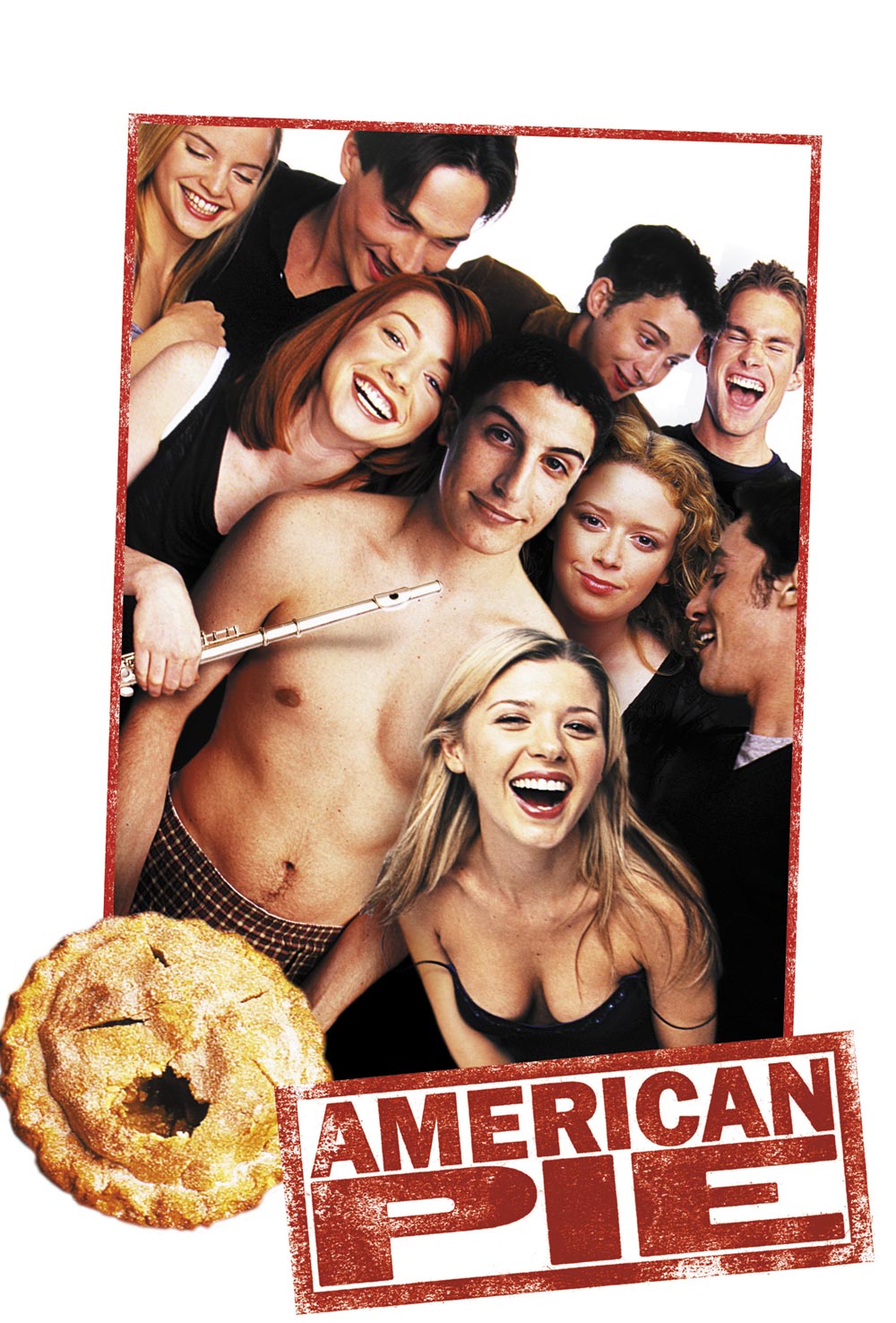
A) The extract is the opening scene from the 1999 movie American Pie. In this short, two minute extract we see the main character, Jim, tending to his manly needs when his mother and father awkwardly walk into his room and discover what he is doing in his room.
 
American Pie (1999) Movie Poster

Halfway through the beginning of the studios credit roll, the audience hears a bass guitar riff which immediately creates a more sexual rather than romantic atmosphere. This tells us that the film's romance is based on vulgar themes rather than the illiterate love scenes you tend to see in films of the romance genre. Therefore, this tells us that there is going to be an element of humour within this film. After a few seconds of the bass riff, moaning can be heard from a female. The tone of her moaning adds to the sexual atmosphere. This combination forms a sound-bridge that flows into the next sequence where there is an establishing shot of a messy bedroom floor.
 
From the establishing shot, we learn that the bedroom belongs to a male character because on the floor are a pair of blue trainers alongside a black gym bag. The trainers also confirm that the character must be of a younger age (younger than 30). At this point, the beginning of the title credits appear on the screen. As the typography has an informal, white font, this confirms that the film has a relaxed setting and does not have a lot of formal, serious content. A sequence shot of the messy floor shows the audience more clothing that has presumably been taken off and thrown on the floor. The camera rolls from the trainers, up the wooden bed post, across a naked leg and then onto a medium-close up of the lead character's facial expression. The expression depicts pleasure meaning that he is obviously enjoying something that is occurring in the background. When related back to the sound-bridge in the studio credit and the lack of lower body costume, this means that the pleasure must be because of sex. As he is on his own in his bedroom, this confirms that he is not actually participating in intercourse. When the camera reaches the medium-close-up of Jim (the character in this sequence), the title credits stop to allow the acting in the background to be the focal point of the sequence.
 
There are a series of cuts to and from the TV, the camera ensuring that Jim's eye-line matches the TV screen. The TV is showing a poor, hazy representation of a porn film. This signifies where the location of the sound-bridge originates from and concludes that Jim is in his room gaining self-pleasure from the video cassette. The poor video reception and the TV represents the film's period: it must have been set at a time when video cassettes were still in fashion so the film must have been set during the 1980s or 1990s (at the time of release, present day). From this point, the camera cross-cuts to and from Jim and the TV screen with the camera maintaining a medium-close-up range during cuts of Jim's facial expression to allow the audience to see his reaction to the porn film.
 
When it comes to diegetic dialogue from the porn film, emphasis has been made on particular phrases to allow fluency in scenes and to add to the sequence's humour. The first notable phrase that the female character says is 'Oh, you're so big'. Whilst maintaining a medium-close-up shot of Jim's facial expression, he lifts up his sock for camera view. An extreme-close up shot of the sock was probably not used because this would have made the scene too cheesy and cheap. There is then a cut to the TV as a male character begins to talk to the female. This annoys Jim and this fury is seen through the facial expression and the annoyed tone in his voice as he speaks bitterly towards the screen when he says, 'Man just shut up!'.
 
From this point on, the number of cuts increases to manipulate the pace. As an audience member, we feel Jim's anxiety as a long-shot cut of Jim's bedroom shows that an older female character has entered the room. Between this cut and the cut where Jim expresses his anger at the TV, there is a sound-bridge of a female character saying, 'Hey Jimmy'. This is the first time the lead character's name is said and this is a brief introduction of his character to the audience. In this series of cuts, the camera constantly returns to the medium-close up shot of Jim to relate back to his reaction and his anxiety of wanting to cover up his embarrassing act. Even when talking to the other lead character, his eye contact remains focussed on the TV screen. This is evident when he quickly says, 'Yeah sweet dreams, night mom'. This address confirms that the other character in the room is actually his mother. Audience members can relate to this cut because they can understand how humiliating it is for a parent to walk in on something awkward such as  an explicit movie.
 
A few seconds later, the female character on the TV exclaims which triggers an extreme-close up shot of the TV remote. This quickly cuts to an medium shot of Jim's mother's confused facial expression. When Jim tries to explain what's 'wrong with the reception', there is a cross-cut between a medium close up of Jim's eye line matching his mother's and the big close-up of the TV screen when what is occurring on the TV adds to the irony of Jim's explanatory speech. This section cuts back a medium shot of the mother shaking her head suspiciously and turning around to exit his room. Just as she is about to leave the room, there is a exclamation of 'Yes' from the TV and Jim's shocked facial expression which leads to him frantically fidgeting with the TV remote (the remote is displayed with an extreme close-up to show the prop's importance in this scene). There is a long shot of the mother hanging onto the door-knob as she continues to examine the programme with intrigue, throwing herself back slightly when the female character on the TV cries, 'Ride me like a pony'. This adds irony to the situation because Jim originally explains that the programme he's watching is a nature programme and the phrase said by the adult actress refers to sex.
 
This cuts to a long shot of the bedroom when the mother steps closer towards the TV and Jim's physicality suddenly becomes frantic. The closer the mother is to the TV, the more horrified her facial expression becomes. The diegetic sound from the TV causes the father in the background to enter the room curiously. When he first speaks to his son, a medium close-up of Jim shows that he is even more nervous now that his dad has entered the room. The audience knows that the older male character is his dad because his first line addresses Jim as his son. When the father joins the mother's side, it cuts to a long shot to allow the audience to observe the mother's reaction.
 
During the father's justification of events, the male character on the TV says, 'Just like my hairy ass'. This causes the father's eye-line to match that of the TV and to ask, 'What was that'. This is another example where the volume of the dialogue on the TV increases to allow the audience to hear what is being said. This adds to the humour of the scene. Then, there is an extreme close-up shot as the father removes the pillow from Jim's crotch to reveal the erect sock. There is a long shot of the bedroom to allow the audience to see the father's stunned facial expression and the mother's turn away in disgust before the camera returns to an extreme-close up of Jim's attempts to cover up the erection with the pillow. There is a medium-close up of Jim's sweaty, embarrassed facial expression when humour is created because of his extremely red face. There is another medium shot then to show the father's panicky tapping of the remote to try and pause the programme. His panicky response adds to the scene's humour as the scene reaches its climax.
 
The sequence concludes with a medium close up of Jim looking down and away in disgust.
 
What genre is this film?
 
From my analysis, I can conclude that this film is definitely a comedy because of the amount of gags that are included in the sequence in an attempt to create humour. However, the tone of the gags is that of a very sexual reference (almost too sexual). The main character's age range is also that of a younger, teenage audience. Therefore, this comedy must be a gross-out comedy because the humour is created through crude material.


05/10/2013

Movie Franchise Poster - The Three Flavours of Cornetto

After finding this on the Internet, I knew that I had to add it to the blog. Although this type of movie poster can only advertise a movie franchise to an audience rather than a single film, I still believe that it is effective in promoting and representing a brilliant (possibly the best, actually) trilogy to be exported out of Britain. The trilogy which I am talking about is the Wright-Pegg-Frost penned trilogy: the Three Flavours of Cornetto Trilogy.
 
When it comes to the British acting duo, Simon Pegg and Nick Frost, the action films Hot Fuzz and Shaun of the Dead automatically spring to mind - not forgetting the last flavour of the trilogy of course: The World's End. Simon and Nick could not have portrayed the leads of these great films without the direction of British writer and director, Edgar Wright. All I can say is if you haven't had seen at least one of these films yet and you can say 'yes' to the following questions:
  1. Are you a fan of action films?
  2. Do you prefer humour to soppy romantic classics?
  3. Are you in dire need of a good film to entertain your nights in?
Then, the Cornetto Trilogy is for you!
 
Containing elements from all of the three films, this franchise poster represents the trilogy to me the most effectively because its simplistic artwork clearly signifies to me what it is trying to promote. Of course, there are elements of it that can only be understood and appreciated by an audience who have watched all of the films such as the swan at the top of the ice-cream cone and the recurring quote 'You want anything from the shop?'. On the other hand, the emblems also signify a nostalgic feel and signify the country's roots. This attracts an audience who may have not watched the films before to go ahead and view them simply because the films are influenced by and appreciate Brits. The mention of several British places in the emblems represent the locations of the three films.
 
The fan-produced trilogy poster containing elements from all of the three films (L-R of emblems at bottom of cone): Shaun of the Dead (2004), Hot Fuzz (2007) and The World's End (2013)

 
The positioning of the Cornetto cone allows the consumer to identify this as being the focal point of the image and the iconic 'criss-cross' pattern on the cone represents the basic link of the three films: the mention of a Cornetto ice-cream (whether this is mentioned in the script or used as a prop by one of the cast members). The red colouring of one of the drops of ice-cream on the cone signifies blood and death. This is one of the several elements of the poster that represent the trilogy's main genre: action.
 
The other elements that represents the films' genre are: the melee weapons at the top of the cone and the pair of pistols at the middle of the cone.
 

The melee weapons are a reference to Shaun of the Dead where the cricket bat and the spades are used to remove the main army in the film: the zombie population of London. For anyone who is still unsure of what Shaun of the Dead is, this film is a zombie comedy (often abbreviated as 'zom com') which is about the title character's attempts to win back his ex but the main problem that distracts his attempts is that overnight, the streets of London have now been infested with zombies . This film reincarnated the 'zom com' genre for a modern-day audience and is a pastiche of George A Romero's 1978 horror 'Dawn of the Dead'. (For those who are not sure what a pastiche is, it is when a media text imitates the work of someone else as a celebration or a tribute to the original artist's work.)


The pair of pistols refer to Hot Fuzz, the second 'flavour' of the trilogy. This was a humorous crime drama that could also have been seen as a pastiche to the 'buddy cop' sub-genre of action comedy films (examples being Lethal Weapon, Point Break, Bad Boys, etc). The title of the film relates to the main theme of the film: 'fuzz' is a colloquial phrase for 'police force'. This informality appeals to the audience because even without having to watch the film, the title signifies a relaxed setting. This represents the film as being humorous and relatable to an audience who do not work with the police. Whilst Shaun of the Dead used melee weapons, Hot Fuzz used gunfights as the main cause of violence.
 
Out of the two elements described, the guns appeal to action enthusiasts the most because the use of guns is a typical code and convention in not only films and movie posters but in media text where action is the main and targeted genre.  
 
 
At the bottom of the cone are two pints of beer. These not only represent the main theme of The World's End: they represent the recurring theme of the three films: the use of a pub as one of the main locations. In Shaun of the Dead, The Winchester is where the climax of the film occurs. In Hot Fuzz, The Crab Inn is a location where many of the film's events occur [including the introduction of Nick Frost's character, Simon Pegg's monologue of why he became a police officer and the confrontation between Simon Pegg and Jim Broadbent's character near the end of the film]. In The World's End, the film's plot is the apocalyptic events surrounding attempts to finally complete an ambitious pub crawl. The pints of beer also signifies a common stereotype of Britain: the pub and the pint of bitter. This appeals to the audience because it represents the British influence behind the films.
 
The final element right at the tip of the bottom of the cone represents the last of the three flavours: it is the map of 'The Golden Mile', the bar crawl of Newton Haven that the five main characters attempt to complete. This element represents The World's End and this is the element that, for me, is the most exclusive when it comes to fan appreciation. The positioning of this element at the bottom of the cone has been made because as it is the latest flavour, people who have seen Hot Fuzz and/or Shaun of the Dead may not have seen this film yet. Therefore, if it was the main focal point of the image, the majority of the target audience may not be attracted to the image because they do not understand why a 'random' map is in the picture. When put into this theory, the map is used as an enigma code for those who have seen the previous two 'flavours' and is intriguing, encouraging that particular audience (fans of the Cornetto Trilogy) to watch this 'flavour'.
 
 
In terms of the image's photography, a basic colour palette has been used to prevent any attention being drawn away from the focal point of the image. The grey background also gives definition to the bold outlining of the elements of the picture. Artwork has been used rather than photography to add to the image's nostalgic feel. The positioning of the elements surrounding the ice-cream cone resemble an emblem (a bit like the Queen's Coat of Arms) and this represents the British influence behind the films. The capitalised typography makes it clear to read and the old-fashioned font also adds to the nostalgic feel.
 
Although this was not a compulsory post for the school's media course, I decided to analyse this poster because for me, it effectively represented three of my favourite films. It also provided me with inspiration for future projects and showed  me that artwork on posters can be just as effective as photography. It also showed me that posters do not necessarily have to include the film's title in order for the audience to identify what film the poster is advertising.
 
(Cornetto - All Rights Reserved to Unilever)


30/09/2013

Ideas for Own Movie Posters - Horror

Although we are only early into the course, it's better to start researching earlier than later. So, in terms of inspiration for my own movie poster, I've started to look for posters that include codes and conventions that would fit in the horror genre.
 
In these selected posters is a recurring pattern: the rule of odds. This photography method really appeals to me because I think that it is an obvious code and convention of the horror genre. Even if the film does not necessarily fit into the horror genre (in this example, Priest is a psychological thriller whilst HP 7 is a fantasy drama), this idea of having only one of the actors in the poster really makes me feel intrigued by its creepy, mysterious atmosphere. I also like the idea of a  black background and low lighting being used, particularly on Ralph Fiennes' character in the Harry Potter poster because it gives his facial features definition and clearly shows his angry facial expression, adding to the film's fear factor. I also like the use of natural light on the Priest poster because this helps the audience's eye level to focus on the foreground of the image: Linus Roache's closed and pessimistic body language. This tells the audience that this character experiences some kind of psychological battle in the film. Therefore, it interests the audience and encourages us to watch that film. The idea of the use of lighting to hide a character's expression (seen in the Dark Skies and Abraham Lincoln posters) is an enigma code and encourages the audience to find out for ourselves about their character and their involvement in the film.


Dark Skies (2013)

 Priest (1994)
Abraham Lincoln Vampire Hunter (2012)


 Harry Potter and The Order of The Phoenix
(2007)