Showing posts with label textual analysis. Show all posts

03/01/2014

'Kidulthood' Movie Poster - Textual Analysis

 
As part of my ongoing research, I have decided to analyse several posters of popular films from the coming-of-age genre. These posters will help me and my final project because any recurring patterns within the films' marketing campaigns will help to structure the marketing campaign for my own movie. It will also help consumers to easily identify what genre my film is by just briefly looking at my film's poster or DVD cover.
 
The second film poster that I am going to analyse is 'Kidulthood'. I decided to analyse this poster because it clearly establishes the genre, the film's social context and what age group is this film's target audience. During its time of release (2006), Kidulthood was critically acclaimed for being - according to the Daily Mail - 'a harrowing, uncompromisingly bleak but thoughtful look at the anguish of being young and poor in Britain' and - according to The Guardian -  'a rollicking UK youth ride, cinematically filmed, persuasively acted and bumped along by a fantastic all-British soundtrack'.
 
ANALYSIS
 
The structure of this poster appears to be in a rule of thirds layout with the top layer containing an important element of typography, the middle layer depicting an even number of cast members casually standing or sitting looking towards the camera and the bottom layer showing the title's typography. This structure effectively creates three focus points for the consumer to look at; the quote at the top of the poster, the cast and the title of the film. This allows the audience to gain a clearer insight into what they can expect from this film.
 
The top third of the poster has a light background due to the bright, natural light from the sky in the photograph which is the poster's main foreground. This light background compliments the black font colour used for the review's typography. This choice of colour draws the audience's attention towards the very positive review given from a national body who have critiqued the film. Not only is there a five-star rating: the quote given by TOUCH magazine describes this film as being powerful, moving and unforgettable. These words are very positive (particularly 'unforgettable' which some may say is a hyperbole in this case) and this second opinion encourages the consumer to go and watch the film to see if the film actually is powerful or unforgettable just like the reviewer suggests. The five-star rating is given to films that are excellent or outstanding. This gives the consumer another reason to watch this film.

The centre third of the poster uses a relaxed version of  the rule of evens when it comes to the positioning of the film's main characters. The rule of evens is typically used when shooting an informal, casual photography of a group of people. This shows to the audience that the characters in this film poster are at ease or comfortable around each other. By positioning the two actors on the left of the third close together, this suggests to the audience that these two characters either have a close friendship or an intimate, romantic relationship. The relationship status is evident what with the male actor resting his left arm around her and the actress not responding in a negative way to his close proxemics. This could also be an enigma code in that their relationship could be a key influence in the film's events. There are several elements of the mise en scene that suggest to the audience that this group of young people are in a poorer area of society. Firstly, all of the male actors are wearing dark hooded jackets or jumpers. This type of clothing is stereotypically worn by gang members or people who are in a poorer area of society. Secondly, the actor on the far right is resting a baseball bat on his shoulder. A baseball bat is not only used to play cricket or baseball: it is also classed as a melee weapon. The actor's menacing glare towards the camera and his casual stance shows the audience that he is most likely using it as a weapon rather than a source of entertainment. This suggests to the audience that the film contains violent or intimidating scenes. It also suggests to the audience that this character could have an aggressive personality. Thirdly, the location of the photograph's shot appears to be within a run-down council estate. There are several elements of the mise en scene that suggest that this location is a council estate, e.g.; some of the actors are sat on top of concrete bollards, others are sat on a small concrete wall barricaded by a corroded iron guard and there is a faint, panoramic view of a run-down area just above the iron guard. This not only suggests to the audience the film's geographical context but it also suggests to the audience the film's genre. Council estates and apartment blocks are location code and conventions for a coming-of-age film. This, alongside the age of the characters in the shot, suggests to the audience that this film is a coming-of-age film. It appeals to fans of gritty coming-of-age films and it encourages them to spend money and watch this film.
 
The bottom third of the poster is where the title's typography is positioned. The bottom third's background is darker in comparison with the other two thirds because it is shadowed by the photograph's angle of light. The charcoal colour of the tarmac makes this third even darker. It compliments the typography's white font colour. This sudden brightness draws in the consumer's attention and it helps them find out the name of this film. It also helps them find out the essential information such as the release date, the age certificate and the studio's logo. It also allows the consumer to read the tagline which is 'Before adulthood comes...'. There is an ellipsis to confirm a dramatic pause. It is almost as if they want the consumer to fill in the blanks for them. As a result, this involves the audience and draws in their attention. The answer to this is the teenage years or childhood. This tells the audience that the characters in this film are either going to be children or teenagers. By viewing the characters in the main third of the poster, the consumer will soon realise that the characters in the film are teenagers or young adults. Teenage or young protagonists are a code and convention of coming-of-age films. This appeals to fan of this genre and it encourages them to go and watch this film. The difference in font size between the tag line's typography and the title's typography helps the consumer to identify what is the title and what is the tag line. The title's typography is all in block capitals except the 'i'. The 'i' emphasizes the word 'kid' in the film's title. The word 'kid' is slang for 'child'. 'Kid' is used as a colloquial phrase so that the consumer knows that this film is set in a modern-day society. The use of this colloquial phrase also suggests to the audience that the characters within this film are from a poorer background and have been raised in an environment where slang is used. This also suggests to the audience that other slang terms or even explicit language could be in this film. This appeals to people who enjoy gritty dramas where the environment is realistic and there is a naturalistic approach towards that film's themes or social issues. The word 'kidulthood' is not a word that is even registered in the dictionary. This is an enigma code because it makes the audience wonder what the phrase 'kidulthood' means and how it differs to being a teenager or a young adult. This amount of intrigue encourages the consumer to watch this film and discover what this phase in life actually is. Also in the bottom third are ways that the audience can access exclusive features that the film offers. There is a html address as well as a mobile number for consumers to text in order to access clips of the film. In terms of the age of audience, these elements of the poster targets the younger audience because it is younger people who tend to use their mobile phones more or browse around the internet on a daily basis. This is also a suggestion to the consumer that this film's target audience is a younger, teenage audience so it may discourage elderly people or parents of very young children from watching the film. Another feature that is in the bottom third of the poster is examples of artists from the film's soundtrack. In this film is music from Roots Manuva and Dizzee Rascal. By mentioning these popular artists, this attracts a different body of potential audience members: people who love listening to these artists and are fans. The choice of music (hip hop, rap and grunge music) also suggests to the audience that this film is aimed at a younger target audience. As a result, this could discourage people who are not fans of these artists from watching this film in order to prevent themselves from listening to their least favourite artist's music.


01/12/2013

'Get Real' poster - Textual Analysis

For my final media project, I have decided to change my genre from thriller to a teen drama due to feedback from a focus group on my script that I produced as a homework task. Although my initial idea was to produce a psychological thriller that would gain audience appeal through the power of character emotion, I soon realised that this was quite difficult to pull off for a targeted young adult audience. However, I still wanted to keep the abuse story theme because I thought that this was an interesting idea to develop. It is also an issue in society that affects all kinds of people who have experienced any form of abuse or witnessed others suffer at the hands of an abuser(s). With it affecting society on a large scale, it is relatable to the audience on a more personal level and, as a result, they would hopefully find it a realistic, respectful approach to a personal matter.
 
Teen drama is a sub-genre of the very broad drama genre that has a plot and themes which specifically target a younger audience. Examples of teen dramas include; Kidulthood (2006), Elephant (2003) and Paranoid Park (2007). However, the teen drama that I am citing influence from is Get Real (1998). The reason why I am choosing this film as an influence for my marketing campaign is because the poster's visual codes represent the themes of the film clearly but still maintaining an enigma code as to how those themes will affect the events as they progress. The poster also introduces the main character, Steven Carter, which signifies that the film is based either on a first person narrative or the photography is based from his perspective on the film's events. Me being a teenager myself, this film appealed to my emotions on a large scale and this is what I hope to achieve from my film.

To help me for future assignments and as inspiration for my own project, I have decided to analyse the film's poster.

GET REAL (1998)


This poster is a brilliant example of an effective teen drama poster in my opinion. Although some consumers may feel that the tagline is too long, I believe that it effectively represents the film's target audience and it signifies what kind of themes and issues this film is going to explore. The larger tagline above the title's typography lists issues that affect teenagers. This represents the film as being a text that specifically targets that young, teenage audience. The list ends with a question. This means that that list has a purpose and it is actually a rhetorical question. This makes the consumer feel more involved with the film so makes them feel almost obliged to watch it to see how these issues are tackled in the film. It is also written in an informal language to help attract the younger audience and to prevent the film from being represented as being formal and very serious.  This informality is also represented through the font that has been used. It also suggests to the audience that this film's setting is based in a modern-day environment rather than it being a period drama. The title's typography is larger and in a red font to help it stand out more against the yellow background. The lack of proper grammar (such as the capital letters and the removal of the full stop) hits hard at the consumer because, to me, it is more like a statement rather than a title. The title is an imperative as well which is also a form of involving the audience. The second tagline underneath the title's typography tells the theme of the film: the term 'out' in this case is a colloquial phrase used by society to describe a person who is confident and free to openly admit their homosexuality (whether they are gay, a lesbian or bisexual). This suggests to the audience that homosexuality and society's perception of it is the main topic that is explored in this film. The tag-line also introduces the lead character: Steven Carter. It also introduces the age group that he belongs to and one of the main locations that provide this film's setting when it says, 'School's out'. Not only does it tell the audience that this film is targeted at an audience that is in the same age group as Carter but it also suggests to the audience that the film is based on his perspective.

The only photograph that is used is a shot of the legs that belong to people dressed in similar uniforms. When people think of school, they automatically think of a smart uniform. This is a continuation of the film's setting. The black and white colour scheme allows the person in the middle to stand out. The clash in colour scheme has purposely been done so that it delivers a message to the audience - that message being that everyone should be allowed to be different without being judged upon. The actor, whose costume is in colour, also crosses their legs to continue delivering this 'standing out' message. This is an enigma code because it makes us wonder whether that actor is Steven Carter or if the photograph applies to the audience on a larger scale in that the issues raised in that list secretly affects many people sat in the same classroom.

The use of the film festival awards shows that the film has received critical acclaim. There is also a review from a professional media body below the festival awards. This creates a positive perception of the film and it encourages the audience to go and watch this film for themselves.

31/10/2013

My Project's Major Influence - Priest (1994)

For my project, I have decided to produce a project based on the Thriller sub-genre because I have always been interested in dramatic films that have a dark twist. A film that belongs to this sub-genre can also include serious themes and explore social issues that affect the everyday lives of that film's target audience. When I was first introduced to this project, I always wanted to create something serious because the final product had a higher chance of appearing more professional and formal. Plus, I was worried that if I did a comedy project, the final product may appear sloppy and will not appeal to the audience as much as I hoped it to. This sub-genre spawns from the Horror genre and, although the idea of producing a horror film sounds fun, I was worried that the creation of gore effects may not be as effective and professional as I had hoped. That was the main decision behind me wanting to do a thriller film.
 
I have decided to analyse the poster and the DVD cover for 1994 Antonia Bird's Priest because I believe that these texts are really effective at appealing to fans of the Thriller sub-genre and attract fans of other genres to go and watch this film. (This film is not to be confused with the 2011 fantasy horror film of the same name.) I have also had the opportunity to watch this film online and I think that it is a very great film that captures and maintains the audience's attention right from the start.
 
Priest stars British actor Linus Roache as Father Greg Pilkington, a closeted priest whose beliefs in sexuality are frowned upon by members of the Church. When a young girl confesses to him that she is the victim of her father's physical and sexual abuse, Roache has to put his own battles aside as he  encounters an emotional struggle of choosing between everyday morals or the values of his religion.
 
ANALYSIS OF THE POSTER
 
 
 In my opinion, I think that this poster is effective because it captures the serious, formal emotion of this media text really well.
 
 This has been created through the photography of Linus Roache's character. A big-close up of Roache has been used as the poster's focal point. This tells the audience that his character is the main character. The rule of odds method that has been used shows that his character is the most important person in this film. This method also creates a dark, tense mood. This helps the audience identify the film's serious content. Although the majority of this poster's lighting is fairly low key, lighting from the centre defines half of Roache's numb, monotonous facial expression. His facial expression signifies that the film does not rely on humour to entertain the audience. Therefore, this tells the consumer that this film is not a comedy. The use of costume signifies that there is a particular theme to the film: the white collar band that Roache is wearing is a typical costume convention that a priest wears. Therefore, this tells the audience that the film's events and plots are influenced by the fact that Roache's character is a priest. His dark, black robes also gives the title's typography definition. There are no special, visual effects in this poster. This not only represents the film's naturalistic theme but it also prevents any attention being drawn away from Roache's face.
 
In terms of the poster's typography, there are elements that help the audience to identify what they can expect from this film. The 'T' in Priest is in the shape of a cross to represent the film's religious theme. The fact that there are several elements that portray this theme tells the audience that religion plays an important role in the film's events. The old-fashioned font relates to the film's influential, ancient rituals. This, alongside the tag-line below the main title, is an enigma code because the content of the tag-line (One man is about to challenge two thousand years of tradition) turns the old-fashioned ritual feel onto its head and makes us question if he will actually be able to defy those rituals and come out stronger. This degree of suspense thrills us and represents the film's genre.
 
If I was to change anything about this poster, I would have removed the second tag-line at the top left (next to Roache's face) because I believe that the previous tag-line is powerful and effective enough on its own so it makes this other tag-line seem less relevant and more like a description for the film's scenario. My definition of a tag-line is an enigmatic statement that can easily be remembered by the consumer. This extra piece of information does not fall under my definition of a tag-line. Also, the white font and the hazy orange background clashes and it is initially quite difficult to read.
 
ANALYSIS OF THE DVD COVERS


The front cover of this DVD is one of my personal favourites of all film covers because the photographic elements have been carefully placed to effectively highlight the film's darker themes. Although there is a certain lack of continuity between the front cover and the poster above, the second tag-line from the poster has been paraphrased and used in this cover as the main tag-line for the film. The tag-line's yellow font, which matches the colour of the light source, stands out amongst the black background. This colour is also used for the reviews as a form of continuity and to signify that the producers believe that they are as equally important (in terms of attracting audience interest) as the tag-line. The reviews are very positive in order to appeal to the audience and to grant them a positive second opinion.
 
There is another slight difference between the poster and the cover - the title's typography. Although the same type of font has been used (including the same cross detail for the T that is an influence of the religious theme), the font in the cover is white with a subtle red glow to allow the consumer to be able to read it. If the cream/yellow colour (like in the poster) was used, the consumer would have difficulty distinguishing it. The colour red gives the consumer connotations of love, lust, blood, warning and death. This is an enigma code because it creates suspense and warns us of events to come. The suspense intrigues the audience and makes us want to go and see the film.
 
I like the front cover's photography because it applies the rule of thirds method except in a diagonal form.  This equally positions the elements of the image and allows the consumer to identify key focal points in the cover. This gives the cover a professional finish and is a form of audience attraction. The image's lighting is low key and its only natural source of light comes from the stain-glassed window at the top of the centre third. The choice of lighting not only creates a dark, intense atmosphere but it also gives Roache's closed body language and estranged expression definition. This allows the consumer to connect with him and to feel his emotion. The stained-glass window is a reference to the film's religious theme: a typical feature of a church are the stained-glass windows. The director (or the person who instructed Roache) has been careful in creating a subtle expression from Roache because if it was over the top, it would misrepresent the film and it could portray the film as being a parody or not serious at all. However, Roache shows the powerful emotion through his face to represent his character's situation and his mental battle with his emotions.
 
The back cover continues the colour scheme that is used for the front cover as a form of continuity. There are even more reviews on the back cover that have been highlighted in yellow to make them stand out amongst the black background. Even more positive reviews from several national bodies suggest that this is a film that can not be missed so, as a result, appeals to the consumer. For the blurb, the first letter is yellow to draw the consumer's attention to that particular section of the cover. This could also be a reference to the film's religious theme because in the Bible, the first word of every chapter always has a very large first letter (as shown in the picture below). When placed into that context, the creator of this cover could have done this to emphasise the importance of this section of the cover. (The blurb is often a section of a DVD or VHS cover that is either over-read or even ignored because of other 'distracting' elements that could be on the cover such as stills of action-filled scenes or visual effects that form a part of the background image.) The last sentence in the blurb [...see this unforgettable big-screen hit for yourself!] uses an imperative that involves the consumer and encourages them to see the film for themselves.
 
An extract from the Bible where the first letter of verse 1
is larger than the rest of the text.
 
The size of the images on the back cover are small so that they do not take over the foreground and stop the consumer from looking at the other elements. It also shows that they are equally as important in terms of attracting consumer appeal as the other elements on the cover. All of the images are of Roache. This emphasises that he is the lead character and is very important in the story. This also shows that the film is taken from his perspective or view of the events. The central image captures Roache hugging another actor intimately and with deep despair. This is an enigma code as it intrigues the consumer and makes us wonder why he looks so upset. This interest encourages the consumer to watch the film and find out what is upsetting him.
 
CONCLUSION - WHAT HAVE I LEARNT?
From this particular film campaign, I have learnt that it is important for a layout to be consistent whether this is on a small scale or if every element is re-used for each way of promoting the film. I have learnt that if continuity is used on a small scale, it is important to re-use the most iconic element because people who may have already seen the film in the cinema will be able to remember it when they see it again in shops or online.
 
I have also learnt that every element of an advert is equally important when it comes to promoting a media text and gaining appeal from the audience. It is because of this that emphasis must be placed on the elements' importance.


21/10/2013

EXTRACT QUESTION - GENRE ANALYSIS

Q) ANALYSE THE EXTRACT COMMENTING ON THE FOLLOWING:
  • VISUAL CODES
  • TECHNICAL & AUDIO CODES
  • GENRE
______________________________________________________________________________________
 
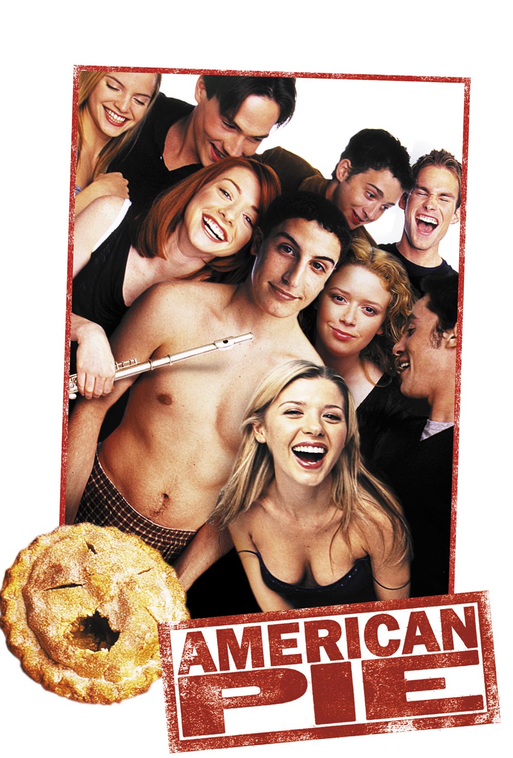
A) The extract is the opening scene from the 1999 movie American Pie. In this short, two minute extract we see the main character, Jim, tending to his manly needs when his mother and father awkwardly walk into his room and discover what he is doing in his room.
 
American Pie (1999) Movie Poster

Halfway through the beginning of the studios credit roll, the audience hears a bass guitar riff which immediately creates a more sexual rather than romantic atmosphere. This tells us that the film's romance is based on vulgar themes rather than the illiterate love scenes you tend to see in films of the romance genre. Therefore, this tells us that there is going to be an element of humour within this film. After a few seconds of the bass riff, moaning can be heard from a female. The tone of her moaning adds to the sexual atmosphere. This combination forms a sound-bridge that flows into the next sequence where there is an establishing shot of a messy bedroom floor.
 
From the establishing shot, we learn that the bedroom belongs to a male character because on the floor are a pair of blue trainers alongside a black gym bag. The trainers also confirm that the character must be of a younger age (younger than 30). At this point, the beginning of the title credits appear on the screen. As the typography has an informal, white font, this confirms that the film has a relaxed setting and does not have a lot of formal, serious content. A sequence shot of the messy floor shows the audience more clothing that has presumably been taken off and thrown on the floor. The camera rolls from the trainers, up the wooden bed post, across a naked leg and then onto a medium-close up of the lead character's facial expression. The expression depicts pleasure meaning that he is obviously enjoying something that is occurring in the background. When related back to the sound-bridge in the studio credit and the lack of lower body costume, this means that the pleasure must be because of sex. As he is on his own in his bedroom, this confirms that he is not actually participating in intercourse. When the camera reaches the medium-close-up of Jim (the character in this sequence), the title credits stop to allow the acting in the background to be the focal point of the sequence.
 
There are a series of cuts to and from the TV, the camera ensuring that Jim's eye-line matches the TV screen. The TV is showing a poor, hazy representation of a porn film. This signifies where the location of the sound-bridge originates from and concludes that Jim is in his room gaining self-pleasure from the video cassette. The poor video reception and the TV represents the film's period: it must have been set at a time when video cassettes were still in fashion so the film must have been set during the 1980s or 1990s (at the time of release, present day). From this point, the camera cross-cuts to and from Jim and the TV screen with the camera maintaining a medium-close-up range during cuts of Jim's facial expression to allow the audience to see his reaction to the porn film.
 
When it comes to diegetic dialogue from the porn film, emphasis has been made on particular phrases to allow fluency in scenes and to add to the sequence's humour. The first notable phrase that the female character says is 'Oh, you're so big'. Whilst maintaining a medium-close-up shot of Jim's facial expression, he lifts up his sock for camera view. An extreme-close up shot of the sock was probably not used because this would have made the scene too cheesy and cheap. There is then a cut to the TV as a male character begins to talk to the female. This annoys Jim and this fury is seen through the facial expression and the annoyed tone in his voice as he speaks bitterly towards the screen when he says, 'Man just shut up!'.
 
From this point on, the number of cuts increases to manipulate the pace. As an audience member, we feel Jim's anxiety as a long-shot cut of Jim's bedroom shows that an older female character has entered the room. Between this cut and the cut where Jim expresses his anger at the TV, there is a sound-bridge of a female character saying, 'Hey Jimmy'. This is the first time the lead character's name is said and this is a brief introduction of his character to the audience. In this series of cuts, the camera constantly returns to the medium-close up shot of Jim to relate back to his reaction and his anxiety of wanting to cover up his embarrassing act. Even when talking to the other lead character, his eye contact remains focussed on the TV screen. This is evident when he quickly says, 'Yeah sweet dreams, night mom'. This address confirms that the other character in the room is actually his mother. Audience members can relate to this cut because they can understand how humiliating it is for a parent to walk in on something awkward such as  an explicit movie.
 
A few seconds later, the female character on the TV exclaims which triggers an extreme-close up shot of the TV remote. This quickly cuts to an medium shot of Jim's mother's confused facial expression. When Jim tries to explain what's 'wrong with the reception', there is a cross-cut between a medium close up of Jim's eye line matching his mother's and the big close-up of the TV screen when what is occurring on the TV adds to the irony of Jim's explanatory speech. This section cuts back a medium shot of the mother shaking her head suspiciously and turning around to exit his room. Just as she is about to leave the room, there is a exclamation of 'Yes' from the TV and Jim's shocked facial expression which leads to him frantically fidgeting with the TV remote (the remote is displayed with an extreme close-up to show the prop's importance in this scene). There is a long shot of the mother hanging onto the door-knob as she continues to examine the programme with intrigue, throwing herself back slightly when the female character on the TV cries, 'Ride me like a pony'. This adds irony to the situation because Jim originally explains that the programme he's watching is a nature programme and the phrase said by the adult actress refers to sex.
 
This cuts to a long shot of the bedroom when the mother steps closer towards the TV and Jim's physicality suddenly becomes frantic. The closer the mother is to the TV, the more horrified her facial expression becomes. The diegetic sound from the TV causes the father in the background to enter the room curiously. When he first speaks to his son, a medium close-up of Jim shows that he is even more nervous now that his dad has entered the room. The audience knows that the older male character is his dad because his first line addresses Jim as his son. When the father joins the mother's side, it cuts to a long shot to allow the audience to observe the mother's reaction.
 
During the father's justification of events, the male character on the TV says, 'Just like my hairy ass'. This causes the father's eye-line to match that of the TV and to ask, 'What was that'. This is another example where the volume of the dialogue on the TV increases to allow the audience to hear what is being said. This adds to the humour of the scene. Then, there is an extreme close-up shot as the father removes the pillow from Jim's crotch to reveal the erect sock. There is a long shot of the bedroom to allow the audience to see the father's stunned facial expression and the mother's turn away in disgust before the camera returns to an extreme-close up of Jim's attempts to cover up the erection with the pillow. There is a medium-close up of Jim's sweaty, embarrassed facial expression when humour is created because of his extremely red face. There is another medium shot then to show the father's panicky tapping of the remote to try and pause the programme. His panicky response adds to the scene's humour as the scene reaches its climax.
 
The sequence concludes with a medium close up of Jim looking down and away in disgust.
 
What genre is this film?
 
From my analysis, I can conclude that this film is definitely a comedy because of the amount of gags that are included in the sequence in an attempt to create humour. However, the tone of the gags is that of a very sexual reference (almost too sexual). The main character's age range is also that of a younger, teenage audience. Therefore, this comedy must be a gross-out comedy because the humour is created through crude material.


09/10/2013

Typography - My Brief Definition


Typography is the art of generating letters and arranging them in ways that portray messages to the audience. When it comes to typography, artists can manipulate the font (typefaces), the point size, the line length (and the number of lines used), line spacing and letter spacing (tracking) to create text on a media text such as a film or a TV programme.
 
Anyone who creates type in a media text is called a typesetter and there are several jobs in the arts industry who fall under this category: graphic/visual designers, comic book artists (such as the artist who created the title and tag-line in this Spider-Man comic cover) and graffiti artists are just a few examples.

These are some examples of Asian-themed
typefaces.
A media text's typography also expresses emotion and helps the company or editor of that text to categorise themselves into genres. Genres can be distinguished through using codes and conventions of that genre to manipulate the way the writing appears to the audience. For example, an editor of a young girl's magazine may use an informal, fluent font (like this) in a feminine colour such as pink or purple to create a bright, girly atmosphere. Another example would be when a historical TV documentary would use an old-fashioned, plain-coloured typeface (such as this) to appeal to a more mature audience. Typography can also be influenced by elements of a media text, e.g.; location and nationalities, period or era of text's setting and themes like war and super-heroes.
 
HISTORY OF TYPOGRAPHY
Before the global digitalization, typography was a specialised occupation and was an art form. Nowadays, anyone is able to use it. Microsoft's programs allow people of even basic computer skills to use WordArt to create titles and add emphasis to particular words in Word documents and Powerpoint presentations. The Digital Age introduced a new generation of graphic designers and truly revolutionised the media industry.
The earliest forms of typography can be traced back to Ancient Greece when dies were used to make seals and coins. In the 11th Century, China created typography for movable texts (i.e.; TV programmes, films, adverts, etc).

RULES OF TYPOGRAPHY:
Every piece of typography follows these four rules:
 
Repetition - being able to easily reproduce the same typeface.
 
Contrast - the difference in colour between the typeface and image so that an audience can easily distinguish it.
 
Proximity - the size of the typeface and how distinguishable it is for an audience.
 
Alignment - how a type flow is set on a page or a column (sometimes called justification)

05/10/2013

Movie Franchise Poster - The Three Flavours of Cornetto

After finding this on the Internet, I knew that I had to add it to the blog. Although this type of movie poster can only advertise a movie franchise to an audience rather than a single film, I still believe that it is effective in promoting and representing a brilliant (possibly the best, actually) trilogy to be exported out of Britain. The trilogy which I am talking about is the Wright-Pegg-Frost penned trilogy: the Three Flavours of Cornetto Trilogy.
 
When it comes to the British acting duo, Simon Pegg and Nick Frost, the action films Hot Fuzz and Shaun of the Dead automatically spring to mind - not forgetting the last flavour of the trilogy of course: The World's End. Simon and Nick could not have portrayed the leads of these great films without the direction of British writer and director, Edgar Wright. All I can say is if you haven't had seen at least one of these films yet and you can say 'yes' to the following questions:
  1. Are you a fan of action films?
  2. Do you prefer humour to soppy romantic classics?
  3. Are you in dire need of a good film to entertain your nights in?
Then, the Cornetto Trilogy is for you!
 
Containing elements from all of the three films, this franchise poster represents the trilogy to me the most effectively because its simplistic artwork clearly signifies to me what it is trying to promote. Of course, there are elements of it that can only be understood and appreciated by an audience who have watched all of the films such as the swan at the top of the ice-cream cone and the recurring quote 'You want anything from the shop?'. On the other hand, the emblems also signify a nostalgic feel and signify the country's roots. This attracts an audience who may have not watched the films before to go ahead and view them simply because the films are influenced by and appreciate Brits. The mention of several British places in the emblems represent the locations of the three films.
 
The fan-produced trilogy poster containing elements from all of the three films (L-R of emblems at bottom of cone): Shaun of the Dead (2004), Hot Fuzz (2007) and The World's End (2013)

 
The positioning of the Cornetto cone allows the consumer to identify this as being the focal point of the image and the iconic 'criss-cross' pattern on the cone represents the basic link of the three films: the mention of a Cornetto ice-cream (whether this is mentioned in the script or used as a prop by one of the cast members). The red colouring of one of the drops of ice-cream on the cone signifies blood and death. This is one of the several elements of the poster that represent the trilogy's main genre: action.
 
The other elements that represents the films' genre are: the melee weapons at the top of the cone and the pair of pistols at the middle of the cone.
 

The melee weapons are a reference to Shaun of the Dead where the cricket bat and the spades are used to remove the main army in the film: the zombie population of London. For anyone who is still unsure of what Shaun of the Dead is, this film is a zombie comedy (often abbreviated as 'zom com') which is about the title character's attempts to win back his ex but the main problem that distracts his attempts is that overnight, the streets of London have now been infested with zombies . This film reincarnated the 'zom com' genre for a modern-day audience and is a pastiche of George A Romero's 1978 horror 'Dawn of the Dead'. (For those who are not sure what a pastiche is, it is when a media text imitates the work of someone else as a celebration or a tribute to the original artist's work.)


The pair of pistols refer to Hot Fuzz, the second 'flavour' of the trilogy. This was a humorous crime drama that could also have been seen as a pastiche to the 'buddy cop' sub-genre of action comedy films (examples being Lethal Weapon, Point Break, Bad Boys, etc). The title of the film relates to the main theme of the film: 'fuzz' is a colloquial phrase for 'police force'. This informality appeals to the audience because even without having to watch the film, the title signifies a relaxed setting. This represents the film as being humorous and relatable to an audience who do not work with the police. Whilst Shaun of the Dead used melee weapons, Hot Fuzz used gunfights as the main cause of violence.
 
Out of the two elements described, the guns appeal to action enthusiasts the most because the use of guns is a typical code and convention in not only films and movie posters but in media text where action is the main and targeted genre.  
 
 
At the bottom of the cone are two pints of beer. These not only represent the main theme of The World's End: they represent the recurring theme of the three films: the use of a pub as one of the main locations. In Shaun of the Dead, The Winchester is where the climax of the film occurs. In Hot Fuzz, The Crab Inn is a location where many of the film's events occur [including the introduction of Nick Frost's character, Simon Pegg's monologue of why he became a police officer and the confrontation between Simon Pegg and Jim Broadbent's character near the end of the film]. In The World's End, the film's plot is the apocalyptic events surrounding attempts to finally complete an ambitious pub crawl. The pints of beer also signifies a common stereotype of Britain: the pub and the pint of bitter. This appeals to the audience because it represents the British influence behind the films.
 
The final element right at the tip of the bottom of the cone represents the last of the three flavours: it is the map of 'The Golden Mile', the bar crawl of Newton Haven that the five main characters attempt to complete. This element represents The World's End and this is the element that, for me, is the most exclusive when it comes to fan appreciation. The positioning of this element at the bottom of the cone has been made because as it is the latest flavour, people who have seen Hot Fuzz and/or Shaun of the Dead may not have seen this film yet. Therefore, if it was the main focal point of the image, the majority of the target audience may not be attracted to the image because they do not understand why a 'random' map is in the picture. When put into this theory, the map is used as an enigma code for those who have seen the previous two 'flavours' and is intriguing, encouraging that particular audience (fans of the Cornetto Trilogy) to watch this 'flavour'.
 
 
In terms of the image's photography, a basic colour palette has been used to prevent any attention being drawn away from the focal point of the image. The grey background also gives definition to the bold outlining of the elements of the picture. Artwork has been used rather than photography to add to the image's nostalgic feel. The positioning of the elements surrounding the ice-cream cone resemble an emblem (a bit like the Queen's Coat of Arms) and this represents the British influence behind the films. The capitalised typography makes it clear to read and the old-fashioned font also adds to the nostalgic feel.
 
Although this was not a compulsory post for the school's media course, I decided to analyse this poster because for me, it effectively represented three of my favourite films. It also provided me with inspiration for future projects and showed  me that artwork on posters can be just as effective as photography. It also showed me that posters do not necessarily have to include the film's title in order for the audience to identify what film the poster is advertising.
 
(Cornetto - All Rights Reserved to Unilever)


30/09/2013

Ideas for Own Movie Posters - Horror

Although we are only early into the course, it's better to start researching earlier than later. So, in terms of inspiration for my own movie poster, I've started to look for posters that include codes and conventions that would fit in the horror genre.
 
In these selected posters is a recurring pattern: the rule of odds. This photography method really appeals to me because I think that it is an obvious code and convention of the horror genre. Even if the film does not necessarily fit into the horror genre (in this example, Priest is a psychological thriller whilst HP 7 is a fantasy drama), this idea of having only one of the actors in the poster really makes me feel intrigued by its creepy, mysterious atmosphere. I also like the idea of a  black background and low lighting being used, particularly on Ralph Fiennes' character in the Harry Potter poster because it gives his facial features definition and clearly shows his angry facial expression, adding to the film's fear factor. I also like the use of natural light on the Priest poster because this helps the audience's eye level to focus on the foreground of the image: Linus Roache's closed and pessimistic body language. This tells the audience that this character experiences some kind of psychological battle in the film. Therefore, it interests the audience and encourages us to watch that film. The idea of the use of lighting to hide a character's expression (seen in the Dark Skies and Abraham Lincoln posters) is an enigma code and encourages the audience to find out for ourselves about their character and their involvement in the film.


Dark Skies (2013)

 Priest (1994)
Abraham Lincoln Vampire Hunter (2012)


 Harry Potter and The Order of The Phoenix
(2007)


26/09/2013

Textual Analysis - Hot Fuzz Opening Sequence


With this film from Edgar Wright being one of my favourite films (and one that I freely admit to watching beyond counting on my fingers), I decided to analyse the opening for Hot Fuzz because although the film is not necessarily a global hit, for me it has one of those openings that I can easily picture on my head.
To clarify the opening for those who haven't watched it, this is basically the perfect two minute description of Sergeant Nicholas Angel, the workaholic officer (played by Simon Pegg) who lists his accolades and achievements almost like a recital. During his extensive monologue are fast paced cuts that cross to and from the film's present time until Angel reaches the door of the Chief Inspector's office (who happens to be played by Bill Nighy, another great British actor).
Whilst the studio credits roll, the non-diegetic wailing of sirens clearly states to me that this movie involves the forces to some degree. Then, there is a long, uninterrupted shot of Pegg marching from the bottom of a reception hallway to the desk with the camera at an extra-long shot. What makes this cut seem even longer is the echoing of Pegg's boots tapping on the linoleum floor while he walks and this gradually increases in volume as he walks closer to the camera. Once he finally reaches the desk, he pulls a serious facial expression to provide his character with a bit more depth before there is an extreme close-up shot of Pegg's Police Identification Card.
 
  
To me, this is a great establishing shot because we are then able to identify not only his character's name but his occupation and the main theme that runs through this film too: the Police force or 'The Fuzz'. If viewers don't quite catch his name on the card, Pegg slowly pronounces his name with his voice becoming a voice-over for the remaining minute and a half.
 
From this point, Pegg's monologue is accompanied with a series of fast-paced flashbacks depicting in chronological order his career in the force. During this, the main non-diegetic music delivers a rock and roll feel to not only lighten the mood but to give the flashbacks almost a kind of nostalgic feel. The cuts range from close-ups of Pegg's consistent serious facial expression to centre shots of him in action whether that is in training or as a part of the police riots squad. For whatever type of shot that is used during this monologue, the camera team has made sure that Pegg remains the focus of each shot whilst they either zoom in to big close ups or zoom out to medium shots. (As if none of the other characters are relevant, when put in that way it also portrays his character with some kind of arrogance and self-absorbance). During the graduation ceremony, there is some diegetic applause and flickers of light from camera shots as Pegg is pictured slightly smiling with his graduation class (still remaining the centre of the focus line for the camera). What is also consistent though is that each brief scene starts/finishes with a graphic swipe to prevent the pace from slowing down.
 
  
There is one particular moment when Pegg quotes, 'quickly established an effectiveness and popularity within the community' and it cuts to the officer giving a lecture to a group of young convicts. The complete irony of this quote is that the group of men in the room appear less than interested in Pegg's lecture about social issues (the exact issue was not clarified in the scene). I was able to pick this up because the camera does a back shot of Pegg's body in order to face the group of men who are sat down looking bored at the level of the camera. With the room only being lit by a blue projector light, this casts a black shadow over Pegg's body so that his expression is hidden and the expressions of the men are highlighted. This is one of the cuts when a distinctive quote is said from Pegg, 'Use your brains' and this is also ironic because these group of men can't have been that conscientious in order to get into that situation that they were in in the first place.
 
A pattern that I seemed to notice in this opening sequence was that although alternating dolly shots were used, Pegg’s facial expression would often be the link for the next cut. For example, a dolly shot is used to zoom in closer to Pegg’s face when he has completed his theory exam before everyone else. His face almost expresses boredom to show that despite the complex examination, it did not seem to faze him or make him nervous. The next scene cuts into a dolly shot zooming out to show Pegg’s more uplifting facial expression when he is pictured holding the Baton of Honour at the graduation ceremony. This is an effective fluency between cuts because it does not decrease the fast pace that Edgar Wright – the director – wanted to create.
Between the montage of cuts, a track shot is used to follow Pegg to the Chief Inspector’s Office. Throughout this opening sequence, a triple shot cut is used, using crash zoom to zoom in closer to Pegg’s face from medium long shot to big close-up to allow the camera to capture Pegg’s consistent serious facial expression. This tripling method is also used when Pegg’s voice-over says, has received nine special commendations, achieved highest arrest record for any officer’. The camera crash zooms onto the array of police commendations on the walls, focusing particularly on the mention of ‘Nicholas Angel’ to let the audience know that all of these certificates belong to Pegg. The camera zooms from big close-up to an extreme close-up of Pegg’s character’s name.
The final section of cuts in this sequence is the link between Pegg’s hand and when he sustained his most memorable of ‘three injuries in the line of duty’ when he was ‘wounded by a man dressed as Father Christmas’. This begins with a series of crash zooms from a medium long shot of Pegg knocking the door (the diegetic sound of him knocking on the door is heard) to an extreme close up of Pegg’s right hand. We soon learn that this is the same hand that was stabbed by the criminal dressed as Father Christmas. We know this because the extreme close up of his fist then cross-cuts to a shot of Pegg being held and intimidated with a knife by the criminal. At this point, the non-diegetic rock and roll music stops and what we can hear is the squirting of blood (although we are unable to see this, probably to reduce the graphic imagery) and Pegg exclaiming in pain. The picture below depicts the final cut of this scene which finishes with a flicker as if it is a photographic memory for his character.

The establishing shot of the opening sequence.
 
  
The final cut of Pegg and the convict santa which forms the end of the opening sequence.